Ever spotted a van with bold branding—or one that left you guessing before it sped off? That’s the challenge of van graphics: they must be clear, eye-catching, and quick to read on the move. A branded van acts as a mobile billboard, promoting your business while driving, parked, or stuck in traffic. However, designing graphics that remain readable at speed takes skill and strategy. In this blog, we’ll explore how to create van graphics that not only grab attention but also communicate your message effectively, even in motion.
Understanding How People See in Motion
When a van is in motion, a person has only a few seconds—sometimes just 3 to 7 seconds—to notice and process what they’re seeing. Whether it’s a driver in traffic or a pedestrian walking by, their attention is limited.
Human eyes are naturally drawn to large, bold text and familiar shapes like logos. While stationary signage can afford to include more detail, van graphics must be kept simple and easy to digest at a glance. Clarity, not complexity, is key when designing for movement.
Prioritise Key Information
The main goal of van branding is to communicate essential details quickly. That means prioritising the following:
- Business name or logo
- A short tagline or description
- A contact method, such as a phone number or website
These three elements should be the largest and most visible. Everything else—like services offered, awards, or slogans—should be kept minimal or removed altogether.
Your van should deliver one clear message, not a cluttered story. People won’t have time to read long paragraphs or multiple bullet points. Stick to a short message that’s easy to remember.
Font Choice & Typography Tips
The fonts you choose play a major role in whether your van graphics are readable. The best fonts are bold, clean, and sans-serif. Popular choices include Helvetica, Futura, and Arial.
Avoid fancy script fonts, thin lettering, or fonts with intricate details. These may look stylish up close, but are very hard to read at a distance or when the van is moving.
Some practical typography tips include:
- Use large font sizes, especially for your business name.
- Space letters and lines adequately to avoid cramping.
- Keep a strong contrast between the text and background.
For example, white text on a dark blue background works much better than light grey text on a white background. Strong contrast improves readability significantly.
Colour Theory in Motion
Colour is another key element in making your design stand out. Your colour choices should support readability, not overwhelm the viewer.
Here are a few basic rules:
- Use your brand colours, but don’t use too many.
- Stick with 2–3 main colours to avoid visual overload.
- Choose high-contrast combinations (like black on yellow or white on navy).
It’s also useful to think about colour psychology. Red can signal urgency or excitement, while blue can convey trust and professionalism. Think about how you want people to feel when they see your van.
And remember—just because a colour is bright doesn’t mean it’s effective. Neon shades might grab attention, but can be hard to read.
Graphic Placement & Flow
Where you place your graphics matters just as much as what they say.
Think of your van as having a natural flow from front to back. People’s eyes tend to follow this direction as the vehicle moves. Use this to your advantage by designing a layout that leads the viewer from the logo to the contact details.
A few placement tips:
- Put your main message on the sides and rear of the van—the areas most visible on the road.
- Avoid placing important text over complex images or textures.
- Make sure your design doesn’t interfere with door handles, windows, or the contours of the van.
White space is also your friend. Don’t feel the need to fill every inch with design. Clean, uncluttered layouts are easier for people to process quickly.
Testing Your Design in Motion
Before committing to a final wrap or print, test your design in real-world conditions.
You can create a mock-up using design software or even print a temporary version through sign printing services and place it on your van. Drive it around and see how it looks in traffic or from a distance. Ask friends or colleagues to give feedback.
Try recording a short video of the van while it’s in motion. Can you read the text easily? Is the message clear in just a few seconds?
It’s much better to discover issues during the testing phase than after your full wrap is applied.
Trends & Innovations in Van Graphics
While simplicity is key, there are some creative trends worth exploring:
- Reflective vinyls: These help your van graphics stand out at night, especially under street lights or headlights.
- QR codes: These can work well on the back of a van, where drivers have a few moments to scan them while stopped in traffic.
- Interactive elements: Some businesses are experimenting with augmented reality or motion-sensitive designs.
These features can add a unique touch, but they should never compromise readability. Always test these ideas to ensure they serve your message, not distract from it.
Conclusion
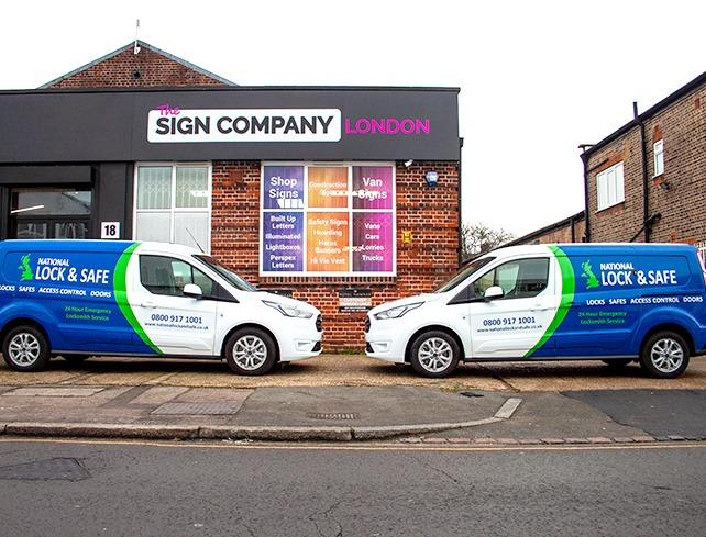
Designing van graphics for visibility on the move is about clarity as much as style. Keep it bold, simple, and legible—using strong contrast, clean fonts, and smart layout. Always test how it looks in motion. Your van is a moving advert, generating thousands of daily impressions. A well-designed wrap builds brand awareness wherever it travels. At Sign Company London, we specialise in professional van graphics and sign printing. Whether you're starting fresh or updating an existing design, we’ll help your brand stay clear, bold, and memorable—even at motorway speeds.